For 18 months now we have been managing advertiser pitches to choose agencies using video conferencing. Zoom, Teams and Google Meet have become a way of doing business. IT departments have had to accommodate users embracing video conferencing as people work from home during the pandemic.
But even with vaccinations offering a light at the end of the tunnel, it is likely that business will continue to embrace video conferencing as a way of doing business. And in many ways, this is great. It is faster, eliminates travel time and reduces cost.
But there is one area where video conferencing is seen as a hindrance rather than a help – new business pitches, particularly in advertising.
Why?
The main complaint is that agencies struggle to read the room. But the truth is that, since the start of the pandemic, few agencies have mastered video conference presentations, including everyone from the big holding companies to the small independents.
I was sharing this with Simon Joyce, founder and CEO at the independent creative agency, Emotive. We both found it amazing that companies who spend thousands of working days and millions of dollars producing hours and hours of video for their clients, appear to spend no time or money producing a video conference. Especially a video conference where the outcome could result in winning a new client and increasing agency revenue.
We hatched a plan to turn the insights and lessons we had learned managing pitches into an instructional video for advertising agencies. Then again, this could be useful for anyone that uses video conferencing for business. So here it is: “Video Conferencing for Dummies – The Ad Agency edition.
Let’s start with the simple ones to fix.
Eye Contact
As humans, we connect by making eye contact.
That is not looking at the screen. That is looking at the camera.
Too often we look disengaged because we are looking down or looking anywhere but at the audience.
To remind yourself to look at the camera, take a little sticker and write on it – LOOK HERE! And place it on or next to the camera lens on your computer.
It is to remind you to look at the audience occasionally.
I say occasionally because if you stare at the lens, and therefore the audience, you can just look creepy.
But if you never look at them you just look uninterested.
It is particularly good to look at the lens when you are saying something of great importance or gravitas.
This is not just for the presenter. It also applies to all of your team.
When someone is talking from your team, everyone else should be looking and paying attention.
Because you don’t know if the client has you on gallery mode, in which case they will be judging the believability of the speaker by the reaction of the team.
If your ECD is talking about how creative you are and the agency team is looking distracted and uninterested, how believable will they appear?
Lighting
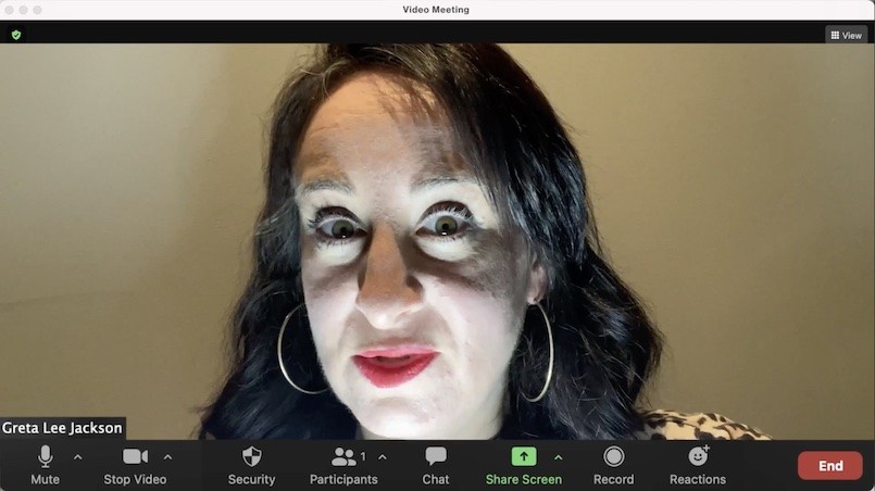
If you are heavily backlit, you appear as a silhouette, which can be quite sinister.
Too much light below and you look sinister too.
In fact, it is best to avoid shadows on your face generally.
This is why all of the influencers and Tik Tockers invest in a ring light or ‘beauty’ light. It provides a flattering, even light. And the ring shape highlights the eyes (unless you wear spectacles).
If you can’t afford a ring light, then position your camera, so you are looking into a light source, such as a big, sunny window.
After all, we all want to present ourselves in the best light when we are meeting a potential client for the first time.
Framing
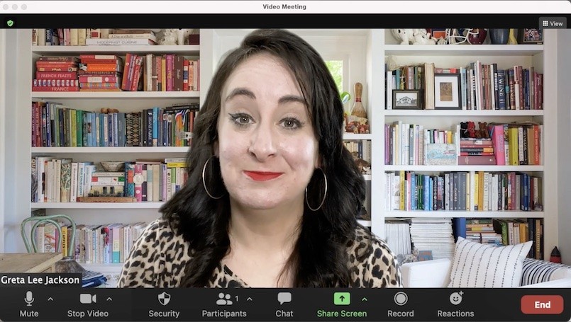
The first thing to consider is how you appear. I don’t mean hair and make-up. But that can help. At least be well presented. It is a business meeting.
But how do you appear on screen? Because the way you appear on screen is how other people will see you. People who in this case, are making a decision on whether they want to work with you.
Too low in the frame and you look like you have a Napoleon complex.
Too high in frame and you could be cutting off your face.
Have the camera too low and we will be looking up your nose.
Too high and you look small again.
If your camera is too low, do not tilt the camera to look up your nose. Instead, use books or a stand and raise the camera so it is eye level or a touch lower.
If it is too high, lower the camera to eye level.
It is simple enough to do and makes a huge difference.
The next question is how big in the frame you should be? Or how far away the camera should be?
Too far away and you appear distant (and your audio can echo, depending on the room you are in and the microphone you are using).
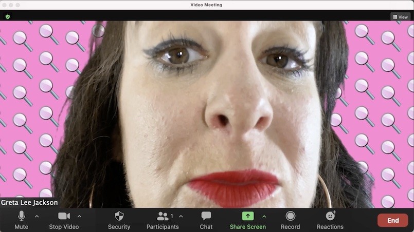
Too close to the camera can be potentially uncomfortable for the viewer as you invade their personal space.
The ideal framing is the ‘second button’ framing, which is having you fill the frame from the top of your head to the second button on your shirt.
Or if you are wearing sweats, then it’s where a second button would be – if you had bothered to dress up for the meeting.
Backgrounds
On the theme of the best presentation, the background is important.
How many videos have we seen online from business meetings, where a child, partner or housemate has walked through the background causing at the minimum a distraction and at the most, keen embarrassment?
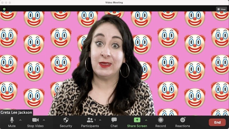
Ideally, choose a background that is not too distracting. The focus should be on you. If there are doorways, make sure you close the door, rather than reveal the rest of your home, such as a bedroom or a bathroom.
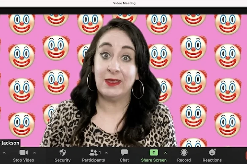
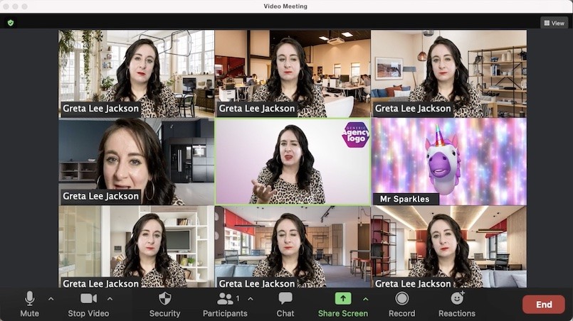
But even better is using technology to create an agency background.
Select a strong colour associated with the agency. Put the agency logo in a corner if you like (and make sure you mirror it, so it turns out the right way around on the video stream).
In this way, when the video conference is in gallery mode, the agency team is instantly recognisable by the background. It makes you look like a team, even if you aren’t one.
It also looks very professional. Well, more professional than showing people into your home.
Direct the format
Almost all the popular video conferencing platforms have settings. They can show gallery mode (also known as The Brady Bunch for the grid) or speaker mode.
It is okay to request that the audience has their browser set to the right mode at the right times in the meeting.
Gallery Mode is a great format for discussions and Q&A.
Speaker mode is best for presenting.
But beyond that, it is also acceptable to request people to make the browser full screen. This reduces distractions and maximises the screen real estate and the impact of the presentation.
All you have to do is ask and be prepared to give people a couple of simple steps on how to get there.
You can even send them a short instruction video prior to the meeting if you are too shy to make this simple request on the day.
The real benefit of doing this is that, from the start, you are directing the meeting. And that puts you in charge.
Screen Space
This is going to challenge all the agencies out there who are obsessed with their PowerPoint or Keynote decks. In fact, it is possible agencies spend more time and consideration on their presentation deck than they do on the actual presentation.
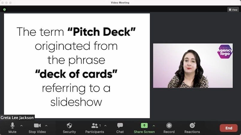
The problem with video conferencing is that sharing your presentation means that you, the presenter, become small. Like postage stamp size.
Now, I know you burnt the midnight oil putting the presentation together, but potential clients do not buy you based on your skills with PowerPoint. People buy people.
So why give up the opportunity to connect face to face to share a PowerPoint slide from which you will largely just read?
I am not saying do not use PowerPoint. Just use it sparingly.
If you have something to say, say it.
If you have something to show, show it.
But don’t show what you can say.
I once had an agency show me their agency purpose, which the CEO read from the PowerPoint screen. The impression it left was that their purpose was of so little importance that even the CEO could not remember it, let alone believe it.
Summing up
There are plenty of more tips to be more compelling and believable and effective on video conferencing during a pitch.
These are just the basics. If you want more, please let us know.
But to get the basics right, in no particular order:
- Make sure you frame yourself to fill the screen and encourage connection with the audience.
- Put yourself in the best light, even if that means investing in a beauty-light
- Have a background that is at least not distracting and ideally makes you look like a team
- Direct the format so that the audience gets the best view of the meeting
- Don’t give up your screen space unnecessarily to a presentation. Keep the spotlight on you and your team
- Maintain eye line by looking at the camera to signal to the audience you are interested and engaged
A big thank you to Simon Joyce and his team at Emotive, the writers, Greta Lee Jackson and Grant McAloon, and the fabulous presenter and actress, Greta Lee Jackson.
*FOR DUMMIES® is a registered trademark of Wiley Publishing, Inc.

